Note
Go to the end to download the full example code
Plot a spectrum
This is an example showing how to plot a spectrum with the
mcalf.visualisation.plot_spectrum() function.
First we shall create a list of wavelengths, with a variable wavelength spacing. Next, we shall use the Voigt profile to generate spectral intensities at each of the wavelength points. Typically you would provide a spectrum obtained from observations.
import numpy as np
wavelengths = np.linspace(8541, 8543, 20)
wavelengths = np.delete(wavelengths, np.s_[1:6:2])
wavelengths = np.delete(wavelengths, np.s_[-6::2])

from mcalf.profiles.voigt import voigt
spectrum = voigt(wavelengths, -526, 8542, 0.1, 0.1, 1242)
Next, we shall import mcalf.visualisation.plot_spectrum().
from mcalf.visualisation import plot_spectrum
We can now simply plot the spectrum.
plot_spectrum(wavelengths, spectrum)
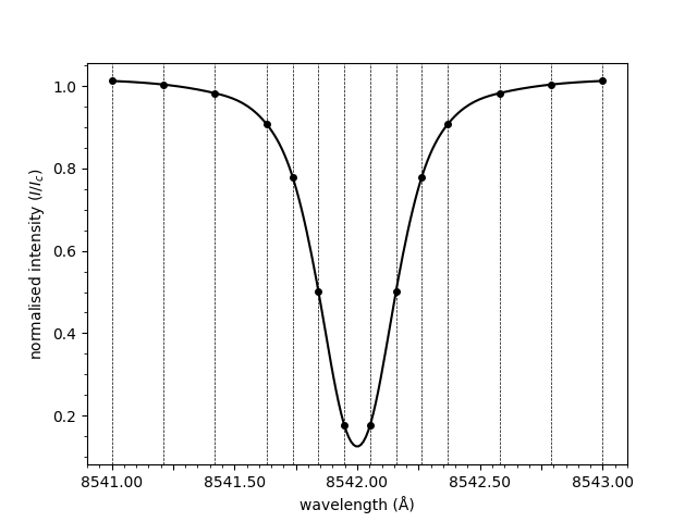
<Axes: xlabel='wavelength (Å)', ylabel='normalised intensity ($I/I_c$)'>
Notice how the spectrum above is normalised. The normalisation is applied by dividing through by the mean of the three rightmost points. To plot the raw spectrum,
plot_spectrum(wavelengths, spectrum, normalised=False)
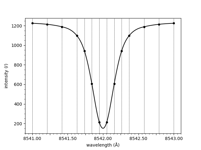
<Axes: xlabel='wavelength (Å)', ylabel='intensity ($I$)'>
The line connecting the points provided in the spectrum
array above is smooth. This is due to spline interpolation
being applied. Interpolation can be disabled, resulting
in a straight line between each of the points.
plot_spectrum(wavelengths, spectrum, smooth=False)
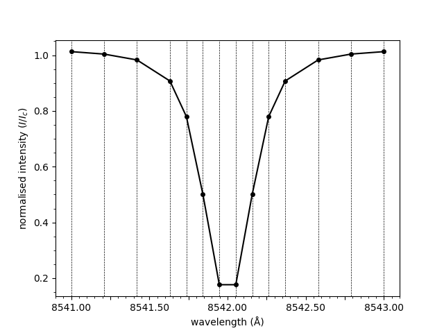
<Axes: xlabel='wavelength (Å)', ylabel='normalised intensity ($I/I_c$)'>
Total running time of the script: ( 0 minutes 0.845 seconds)