Note
Go to the end to download the full example code
Plot a grid of spectra grouped by classification
This is an example showing how to produce a grid of line plots of an array of spectra labelled with a classification.
First we shall create a random array of spectra each labelled with a random classifications. Usually you would provide your own set of hand labelled spectra taken from spectral imaging observations of the Sun.
Next, we shall import mcalf.visualisation.plot_classifications().
from mcalf.visualisation import plot_classifications
We can now plot a simple grid of the spectra grouped by their classification. By default, a maximum of 20 spectra are plotted for each classification. The first 20 spectra are selected.
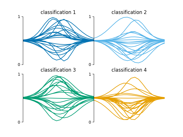
GridSpec(2, 2)
A specific number of rows or columns can be requested,
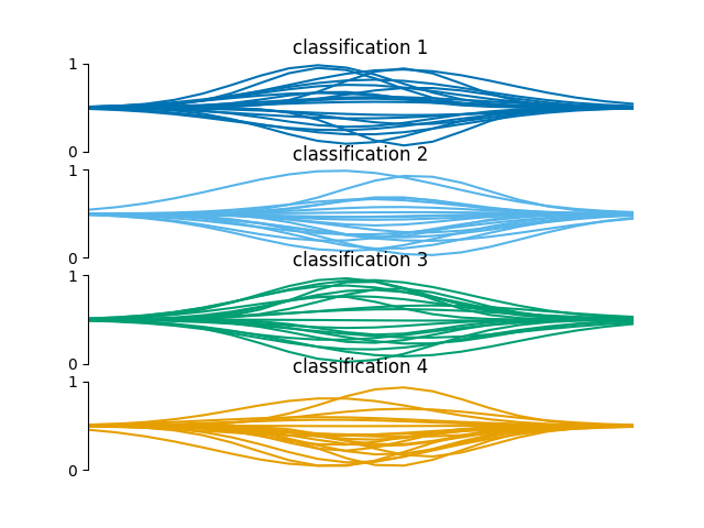
GridSpec(4, 1)
The plot settings can be adjusted,
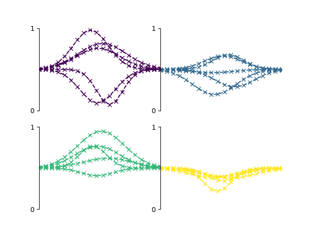
GridSpec(2, 2)
By default, the y-axis goes from 0 to 1. This is because labelled training data will typically be rescaled between 0 and 1. However, if a particular classification has spectra that are not within 0 and 1, the y-axis limits are determined by matplotlib.
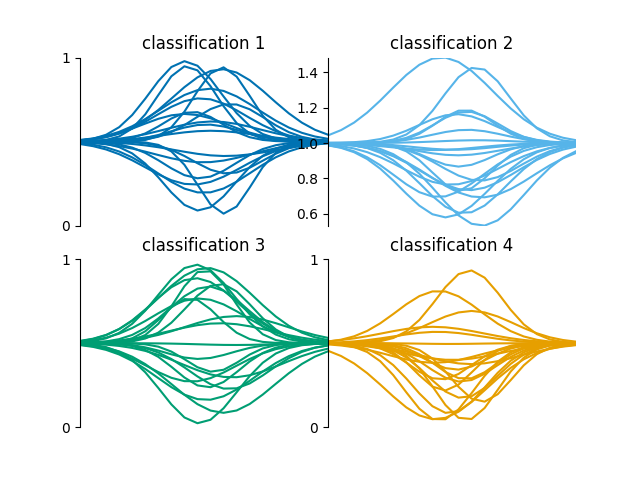
GridSpec(2, 2)
Total running time of the script: ( 0 minutes 0.756 seconds)