Note
Go to the end to download the full example code
Plot a map of velocities
This is an example showing how to produce a map showing the spatial distribution of velocities in a 2D region of the Sun.
First we shall create a random 2D grid of velocities that can be plotted.
Usually you would use a method such as
mcalf.models.FitResults.velocities()
to extract an array of velocities from fitted spectra.
import numpy as np
np.random.seed(0)

x = 50  # 50 coordinates along x-axis
y = 40  # 40 coordinates along y-axis
low, high = -10, 10  # range of velocities (km/s)


def a(x, y, low, high):
    arr = np.random.normal(0, (high - low) / 2 * 0.3, (y, x))
    arr[arr < low] = low
    arr[arr > high] = high
    i = np.random.randint(0, arr.size, arr.size // 100)
    arr[np.unravel_index(i, arr.shape)] = np.nan
    return arr


arr = a(x, y, low, high)  # 2D array of velocities (y, x)
Next, we shall import mcalf.visualisation.plot_map().
from mcalf.visualisation import plot_map
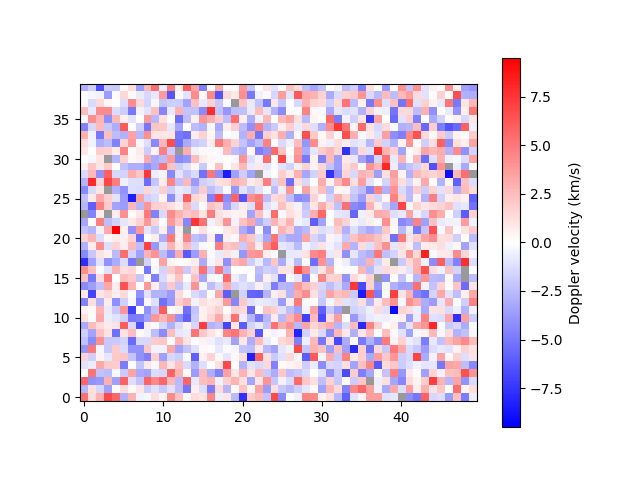
We can now simply plot the 2D array.
plot_map(arr)
<matplotlib.image.AxesImage object at 0x7f7b37ea19a0>
Notice that pixels with missing data (NaN) are shown in grey.
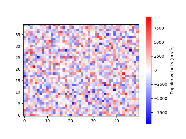
By default, the velocity data are assumed to have units km/s.
If your data are not in km/s, you must either 1) rescale the
array such that it is in km/s, 2) attach an astropy unit
to the array to override the default, or 3) pass an
astropy unit to the unit parameter to override the
default. For example, we can change from km/s to m/s,
<matplotlib.image.AxesImage object at 0x7f7b37fc4f40>
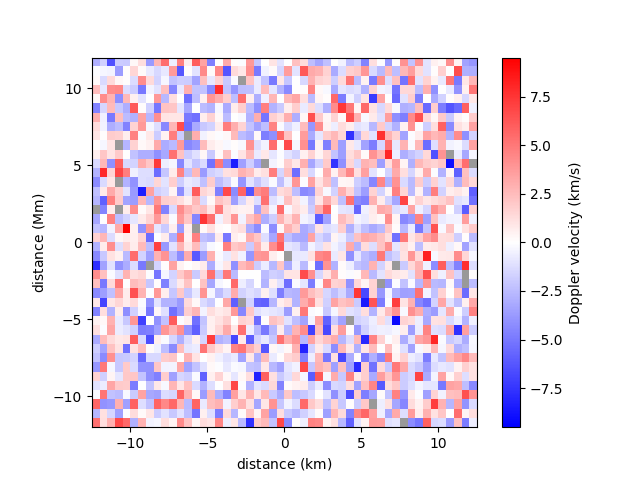
A spatial resolution with units can be specified for each axis.
<matplotlib.image.AxesImage object at 0x7f7b5edda3a0>
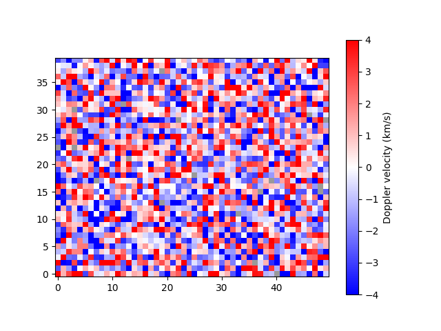
A narrower range of velocities to be plotted can be
requested with the vmin and vmax parameters.
Classifications outside of the range will appear saturated.
Providing only one of vmin and vmax with set the
other such that zero is the midpoint.
plot_map(arr, vmax=4)
<matplotlib.image.AxesImage object at 0x7f7b37db8fd0>
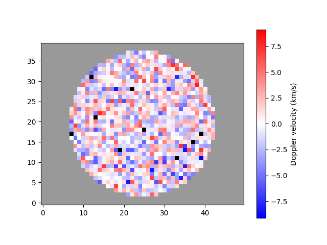
A mask can be applied to the velocity array to isolate a region of interest. This functionally is useful if, for example, data only exist for a circular region and you want to distinguish between the pixels that are out of bounds and the data that were not successfully fitted.
<matplotlib.image.AxesImage object at 0x7f7b3c0d4250>
Notice how data out of bounds are grey, while data which were not fitted successfully are now black.
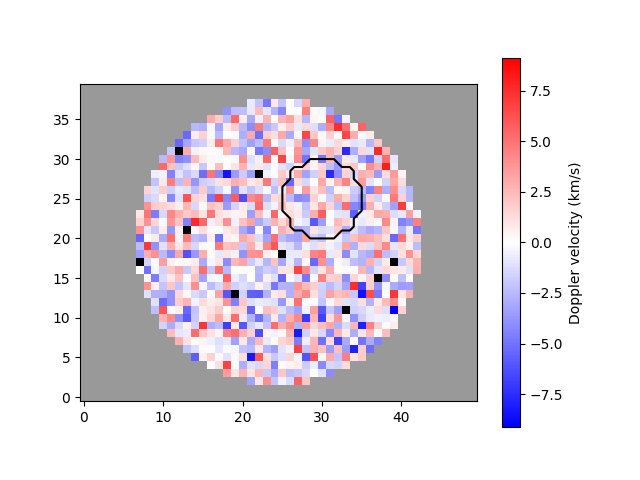
A region of interest, typically the umbra of a sunspot, can be outlined by passing a different mask.
umbra_mask = genmask(50, 40, 5, 5, 5)

plot_map(arr, ~mask, umbra_mask)
<matplotlib.image.AxesImage object at 0x7f7b3fcf69a0>
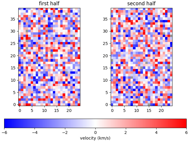
The plot_map function integrates well with matplotlib, allowing extensive flexibility.
import matplotlib.pyplot as plt

fig, ax = plt.subplots(1, 2, constrained_layout=True)

plot_map(arr[:, :25], vmax=6, ax=ax[0], show_colorbar=False)
im = plot_map(arr[:, 25:], vmax=6, ax=ax[1], show_colorbar=False)

fig.colorbar(im, ax=ax, location='bottom', label='velocity (km/s)')

ax[0].set_title('first half')
ax[1].set_title('second half')

plt.show()
Total running time of the script: ( 0 minutes 1.636 seconds)