Note
Go to the end to download the full example code
Combine multiple classification plots
This is an example showing how to use multiple classification plotting functions in a single figure.
First we shall create a random 3D grid of classifications that can be plotted.
Usually you would use a method such as
mcalf.models.ModelBase.classify_spectra()
to classify an array of spectra.
Next we shall create a random array of spectra each labelled with a random classifications. Usually you would provide your own set of hand labelled spectra taken from spectral imaging observations of the Sun. Or you could provide a set of spectra labelled by the classifier.
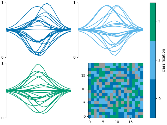
If a GridSpec returned by the plot_classification function has
free space, a new axes can be added to the returned GridSpec.
We can then request plot_class_map to plot onto this
new axes.
The colorbar axes can be set to fig.axes such that
the colorbar takes the full height of the figure, as
in this case, its colours are the same as the line plots.
import matplotlib.pyplot as plt
from mcalf.visualisation import plot_classifications, plot_class_map

fig = plt.figure(constrained_layout=True)

gs = plot_classifications(spectra, labels, nrows=2, show_labels=False)

ax = fig.add_subplot(gs[-1])
plot_class_map(class_map, ax=ax, colorbar_settings={
    'ax': fig.axes,
    'label': 'classification',
})
<matplotlib.image.AxesImage object at 0x7f7b3fde0a00>
The function mcalf.visualisation.init_class_data`() is
intended to be an internal function for generating data that
is common to multiple plotting functions. However, it may be
used externally if necessary.

<matplotlib.image.AxesImage object at 0x7f7b37f09160>
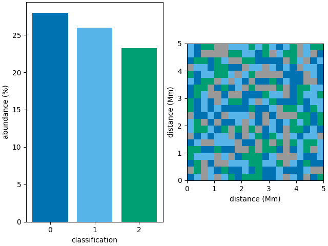
The following example should be equivalent to the example above,
<matplotlib.image.AxesImage object at 0x7f7b5ecd6610>
Total running time of the script: ( 0 minutes 1.136 seconds)