Note
Click here to download the full example code
Plot a map of classifications
This is an example showing how to produce a map showing the spatial distribution of spectral classifications in a 2D region of the Sun.
First we shall create a random 3D grid of classifications that can be plotted.
Usually you would use a method such as
mcalf.models.ModelBase.classify_spectra()
to classify an array of spectra.
Next, we shall import mcalf.visualisation.plot_class_map().
from mcalf.visualisation import plot_class_map
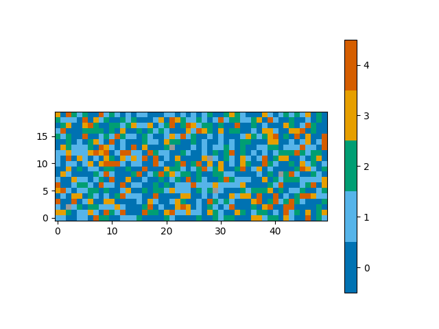
We can now simply plot the 3D array. By default, the first dimension of a 3D array will be averaged to produce a time average, selecting the most common classification at each (x, y) coordinate.
plot_class_map(class_map)
Out:
<matplotlib.image.AxesImage object at 0x7fcfe03d53a0>
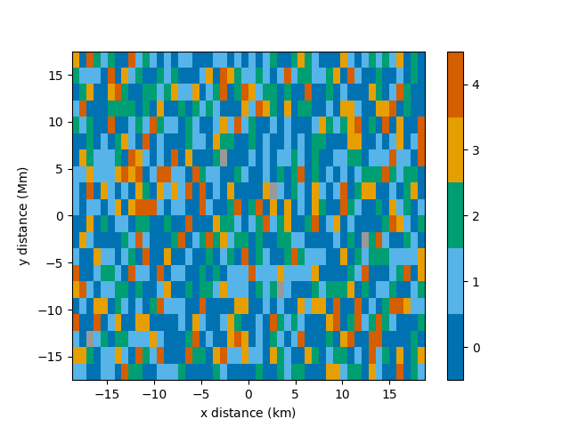
A spatial resolution with units can be specified for each axis.
Out:
<matplotlib.image.AxesImage object at 0x7fcfe2c234f0>
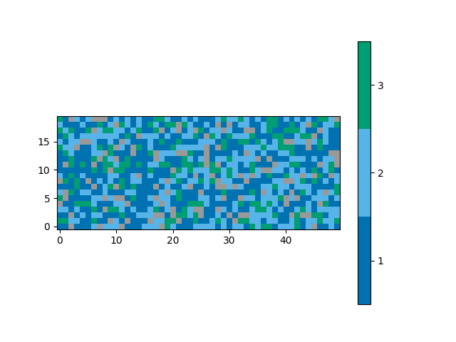
A narrower range of classifications to be plotted can be
requested with the vmin and vmax parameters.
Classifications outside of the range will appear as grey,
the same as pixels with a negative, unassigned classification.
plot_class_map(class_map, vmin=1, vmax=3)
Out:
<matplotlib.image.AxesImage object at 0x7fcfe0302970>
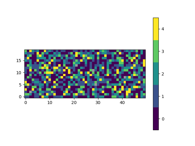
An alternative set of colours can be requested.
Passing a name of a matplotlib colormap to the
style parameter will produce a corresponding
list of colours for each of the classifications.
For advanced use, explore the cmap parameter.
plot_class_map(class_map, style='viridis')
Out:
<matplotlib.image.AxesImage object at 0x7fcfe05f93a0>
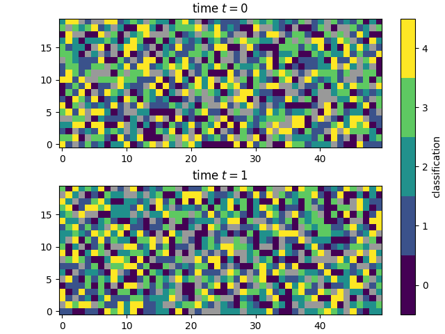
The plot_class_map function integrates well with
matplotlib, allowing extensive flexibility.
This example also shows how you can plot a 2D
class_map and skip the averaging.
import matplotlib.pyplot as plt

fig, ax = plt.subplots(2, constrained_layout=True)

plot_class_map(class_map[0], style='viridis', ax=ax[0],
               show_colorbar=False)
plot_class_map(class_map[1], style='viridis', ax=ax[1],
               colorbar_settings={'ax': ax, 'label': 'classification'})

ax[0].set_title('time $t=0$')
ax[1].set_title('time $t=1$')

plt.show()
Total running time of the script: ( 0 minutes 1.041 seconds)